This page gives and overview of what the Pantone Matching System (PMS) is and does.
Pantone is a company in New Jersey, best known for its color matching system—which is properly known as the Pantone Matching System but is commonly called just "Pantone" as well.
Pantone was originally a printing company, but a part-time hire with a chemistry degree (Lawrence Herbert) eventually bought the company and created a new industry standard to help printers everywhere create consistent, predictable output. Once upon a time, if you wanted to get something printed in a specific shade of, say, green, you might get it, you might not. If you worked with a particular printer you might eventually get exactly what you wanted but there was no way to go to another printer and get the same result.
Printers generated colors by trial and error—very inefficiently—using about 60 inks. Mr. Herbert, with his knowledge of chemistry, was able to reduce that number to 12, while simultaneously creating a better, more predictable process for mixing them.
In 1963, Pantone introduced the Pantone Matching System. When they launched, they wrote to 21 major ink producers, describing the system and offering to license it. It took less than two weeks for all but one of them to sign on and pay a royalty to Pantone. The rest, as they say, is history.
When people say "Pantone," they are usually referring to this standardized collection of colors. (Also known as "Pantone colors" or "PMS colors", for "Pantone Matching System".) With these colors — some are named, most are numbered — you can walk into a print shop and produce a printed page for Target with the exact red that the company specifies, or in IBM's official shade of blue.
The most common use of Pantone colors is in printing. In addition to helping create predictable results, Pantone colors (since they use custom inks) can create deep, vibrant colors not possible with the standard set of cyan, magenta, yellow, and black (CMYK) inks.
Pantone colors can be used in two ways. They can be an additional primary color, mixed with regular inks to get more vibrant colors. Typically orange and green are used. This is also referred to as "hi-fi" color. (Or, the formerly-used, Pantone-trademarked name "Hexachrome".) The other way is to use them as they are as an accent color (also known as a "spot color.") Spot colors are usually used on their own, or possibly mixed with black or white to create related shades. For example, the cover of a catalog from Tiffany might be a solid mass of their official blue.
Pantone colors are typically available in two ways: in physical swatch collections (either books or the ever-popular "fan" style) and as options in computer imaging and layout programs. They are used in many ways. Sometimes a designer will flip through a swatch book, looking for the color that they think works best. Other times, they will hold the swatches next to actual objects to try to find the printable color that comes closest.
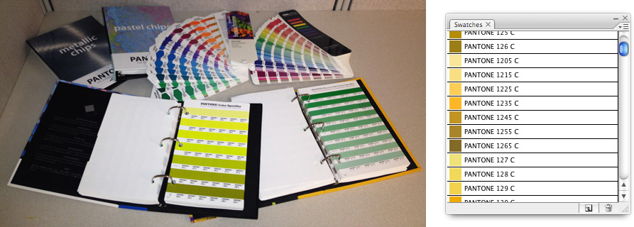
|
| Note that the books are pretty expensive. A complete set costs several hundred dollars. |
By their very nature, Pantone colors cannot be produced with just CMYK inks, but most Pantone colors include conversions to the closest possible match. Programs like Photoshop and Illustrator will also do these conversions automatically—but be aware, this does not mean that "Pantone 3288 C" is the same as 100c 22m 72y 8k. It just means it's the closest within that range.
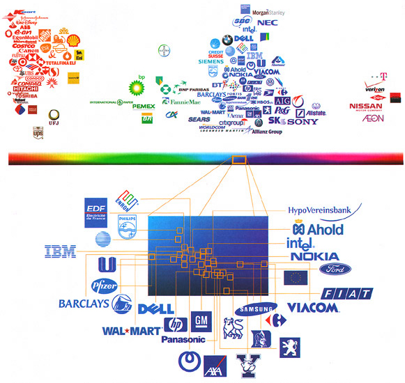
A common task is picking a color for a company logo, like the ones shown above. If you are ever asked to do this, skip past the basic colors in the front of the book or at the top of the list. (I.e., things like "cyan," "magenta," "process blue," or "hexachrome green.")
You might notice that there are several sets of Pantone colors: coated, uncoated, pastel, etc. Some of these are families of colors, like "pastel" or "metallic." Others deal with how they are used. If you print something with a matte (nonreflective) surface, like a newspaper, that is "uncoated." If it's shiny, like a magazine, that's "coated." Pantone also makes "process" books which are collections of colors that are made up of regular CMYK inks. These are so you can a) know how any particular color should look and b) ensure that you're getting the proper color from your printer.
The most common place to see custom inks is, of all places, the grocery store. In the frozen food aisle, for example, you will see many boxes of similar frozen dinners all grouped together. How does a company make their product stand out on the shelf next to all the others? With the most intense, eye-catching, appetizing boxes they can afford. (Like anything else, printing with more and/or higher-quality inks costs more.) Compare the spaghetti or lasagna boxes from a low-cost line (like Banquet) to those from a higher-end line (like Stouffer's or Boston Market) and look at how much more vivid the reds and browns look. On vegetables, a basic green looks fine, but next to a deep, bright, high-end green, the low-cost stuff looks downright murky. The difference comes from the inks they use. Want proof? Carefully open the boxes (note: please purchase the food first) and look at the parts of the flaps that were previously hidden. Printers often print little colored squares in an unseen area to verify that the colors are coming out correctly. You can see if it was printed with the standard four-color process or if additional inks were used.
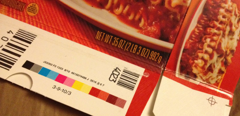
|
|
Print test area on a frozen food box. Each color is followed by a sample at 50%. From left to right: black, cyan, magenta, yellow, custom red, custom brown. |
It takes some work to make a print that blends five or six colors. Using a single custom color is easier but is still beyond the scope of this article. You'll have to look elsewhere, or work with (or for) a professional design or print shop to find out how.
![]()