“Big Text” has gone too far
Seriously, this is bullcrap.
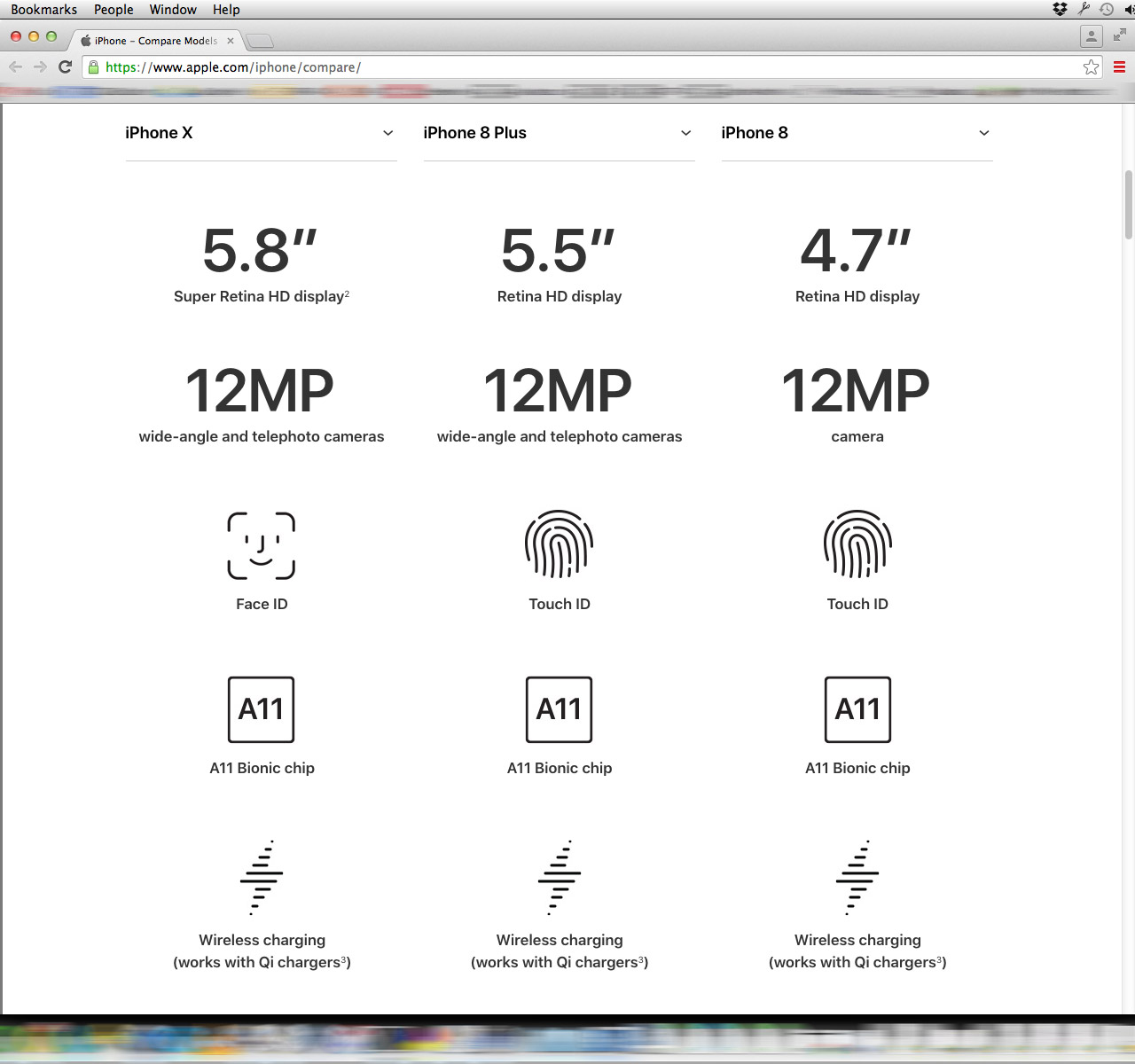
OK, some details: This is Apple’s new “Compare [iPhone] Models” page. This screenshot shows my browser set to 1280px wide, and as tall as it can be, on my 1920×1200px display. 95 pixels at the top of this image are used by the Mac OS* menu bar and Chrome’s title/tab bar, location bar, and bookmarks bar. The bottom 56 pixels are for my Dock. The remaining 1,049 vertical pixels are used for a grand total of SIX lines of text. The fact that it’s scaled down to less than half size here — but still readable — is a good indication that it’s not a particularly efficient use of space.
You know what would help me compare specs? Being able to see lots of info on the screen at once. Maybe I’m not just comparing it all item-by-item. Maybe I want to factor in several things at once. Maybe I’d like to see the weight and the battery life at the same time.
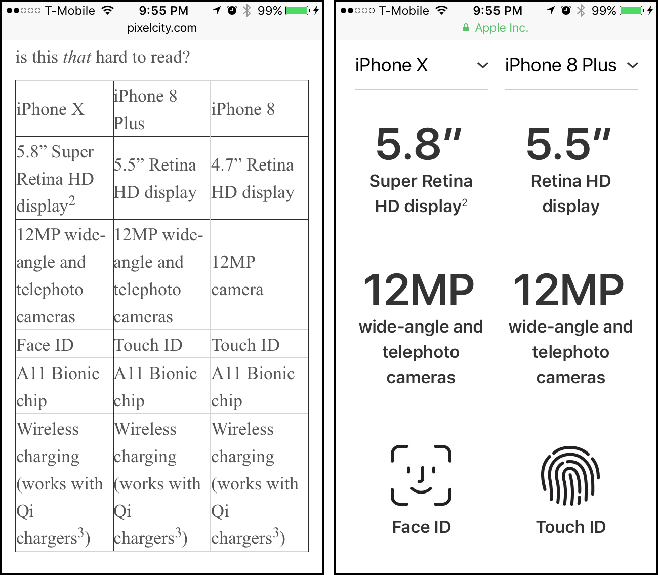
Here is the same info, coming in at 250 pixels tall on my desktop’s screen — just one quarter of the original height. Tell me, is this that hard to read?
| iPhone X | iPhone 8 Plus | iPhone 8 |
| 5.8” Super Retina HD display2 | 5.5” Retina HD display | 4.7” Retina HD display |
| 12MP wide-angle and telephoto cameras | 12MP wide-angle and telephoto cameras | 12MP camera |
| Face ID | Touch ID | Touch ID |
| A11 Bionic chip | A11 Bionic chip | A11 Bionic chip |
| Wireless charging (works with Qi chargers3) | Wireless charging (works with Qi chargers3) | Wireless charging (works with Qi chargers3) |
Also: that table shows up in its entirety on the 4" screen of my iPhone 5S. The Apple page? Just three rows of icons — and just two columns.
* Mac OS X 10.8, so yes, it’s Mac OS, not macOS.