Pixel City
Oh look, another blog about design and technology.
20 Years of Mac OS X
Mac OS X 10.0 was released 20 years ago today, on March 24, 2001. There is plenty of coverage about it like this and this. Here are some quick thoughts from me on every version of Mac OS X (now known as "macOS").
I'm looking forward to Macs with Apple-designed CPUs
In 2003, I had a PowerMac G5 at work. It had two 2.0 GHz CPUs.
When Apple transitioned to Intel CPUs, I got a white plastic MacBook with a 1.83 GHz dual-core Intel Core Duo CPU. (It was quite an upgrade from my 800 MHz G3 iBook.)
I used to rip DVDs a lot. My dual-1.83 GHz Intel laptop could rip DVDs faster than my dual-2 GHz G5 PowerMac. I forget how much faster, but it was significant. I think around 10 or 20%. Considering the CPU was running at an 8.5% lower clock speed, that was very impressive. (And no, it was not because the optical drive was faster. I'd copy the raw contents to the hard drive first, then run them through HandBrake.)
I'm expecting similar awesomeness from Apple Silicon when it starts shipping.
*sigh*
Dear designers at Dropbox,
You've invented a radio button that look unchecked when it's checked. This is not good.
Seriously, I'm not just being snarky here. As someone who actually uses the web interface, this is a big usability pain.
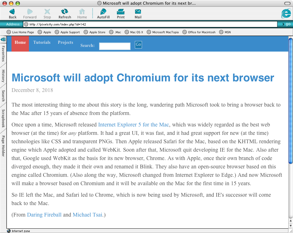
Microsoft will adopt Chromium for its next browser
The most interesting thing to me about this story is the long, wandering path Microsoft took to bring a browser back to the Mac after 15 years of absence from the platform.
Once upon a time, Microsoft released Internet Explorer 5 for the Mac, which was widely regarded as the best web browser (at the time) for any platform. It had a great UI, it was fast, and it had great support for new (at the time) technologies like CSS and transparent PNGs. Then Apple released Safari for the Mac, based on the KHTML rendering engine which Apple adopted and called WebKit. Soon after that, Microsoft quit developing IE for the Mac. Also after that, Google used WebKit as the basis for its new browser, Chrome. As with Apple, once their own branch of code diverged enough, they made it their own and renamed it Blink. They also have an open-source browser based on this engine called Chromium. (Also along the way, Microsoft changed from Internet Explorer to Edge.) And now Microsoft will make a browser based on Chromium and it will be available on the Mac for the first time in 15 years.
So IE left the Mac, and Safari led to Chrome, which is now being used by Microsoft, and IE's successor will come back to the Mac.
(From Daring Fireball and Michael Tsai.)
I don’t think we’ll ever see a small iPhone again
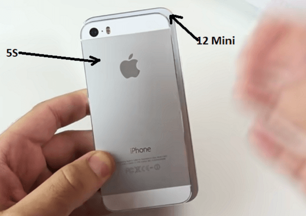
I was surprised that anyone, let alone “Today’s Apple”, would kill the iPhone SE so quickly. It was introduced in March 2016 and got a storage bump in March 2017. In the world of lesser-loved and neglected Apple products, it was practically brand new. Apple is all about keeping products around forever: the Mac mini from 2014, the Mac Pro from 2013, the iPad Mini from 2015, the non-retina MacBook Air from 2015. 3-plus years without an update or price drop is common now. To kill it with no warning just before the new 2018 iPhones came out was practically unprecedented.
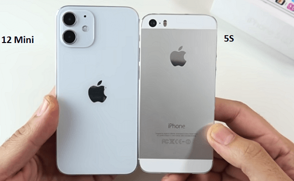
Update, October 23, 2020: Hooray! I was afraid that small iPhones were gone forever, but today Apple came out with the iPhone 12 Mini which is just what I was hoping for/expecting: an X-style device (edge-to-edge screen, no home button) that's about the size of an old 5S/SE. (Photo 1, photo 2.) I hate that the power button has moved to the side, and I'll miss the headphone jack some, but overall it looks good.
Update, September 7, 2022 - dead again.
Predicting the future
I love old predictions of the future. This article, written in 1992 — the dawn of the PDA era — is remarkably prescient.
Once in the meeting, the executive could take notes on the device, and even order pizza for the group using a combination of custom electronic forms and wireless fax. After updating her schedule electronically and sending notes back to her office computer network, she could check restaurant and movie information, including critics' reviews. Back at the hotel, she could plug in the latest disk-based novel.
References to disks and "wireless fax" are quaint, but they pretty much nailed it. You could change a few words in that paragraph and have a script for a smartphone ad.
File this under “design has always mattered”
“Typographic design and type design was born out of forgery, because what Gutenberg was designing was born of the work of scribes,” says veteran typographer Allan Haley, who for 15 years was the director of words and letters at the Monotype type foundry. Haley says this partly in jest, but he explains that Gutenberg mimicked existing calligraphy used for bibles and other Church material to retain the authoritative nature of the previous text by adopting its form. [emphasis mine]
From https://www.wired.com/story/meet-the-font-detectives-who-ferret-out-fakery/
“Big Text” has gone too far
Seriously, this is bullcrap.
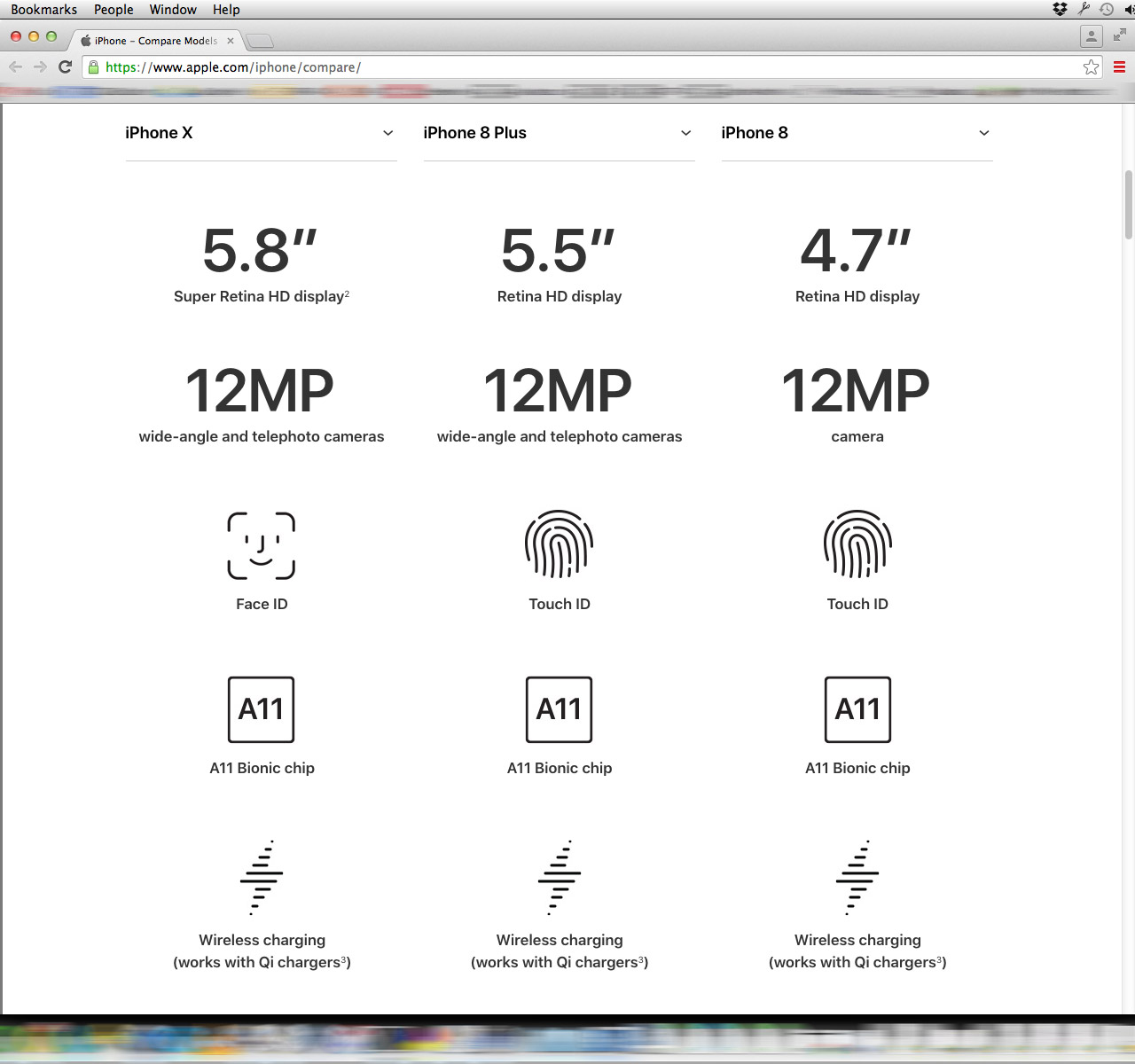
OK, some details: This is Apple’s new “Compare [iPhone] Models” page. This screenshot shows my browser set to 1280px wide, and as tall as it can be, on my 1920×1200px display. 95 pixels at the top of this image are used by the Mac OS* menu bar and Chrome’s title/tab bar, location bar, and bookmarks bar. The bottom 56 pixels are for my Dock. The remaining 1,049 vertical pixels are used for a grand total of SIX lines of text. The fact that it’s scaled down to less than half size here — but still readable — is a good indication that it’s not a particularly efficient use of space.
You know what would help me compare specs? Being able to see lots of info on the screen at once. Maybe I’m not just comparing it all item-by-item. Maybe I want to factor in several things at once. Maybe I’d like to see the weight and the battery life at the same time.
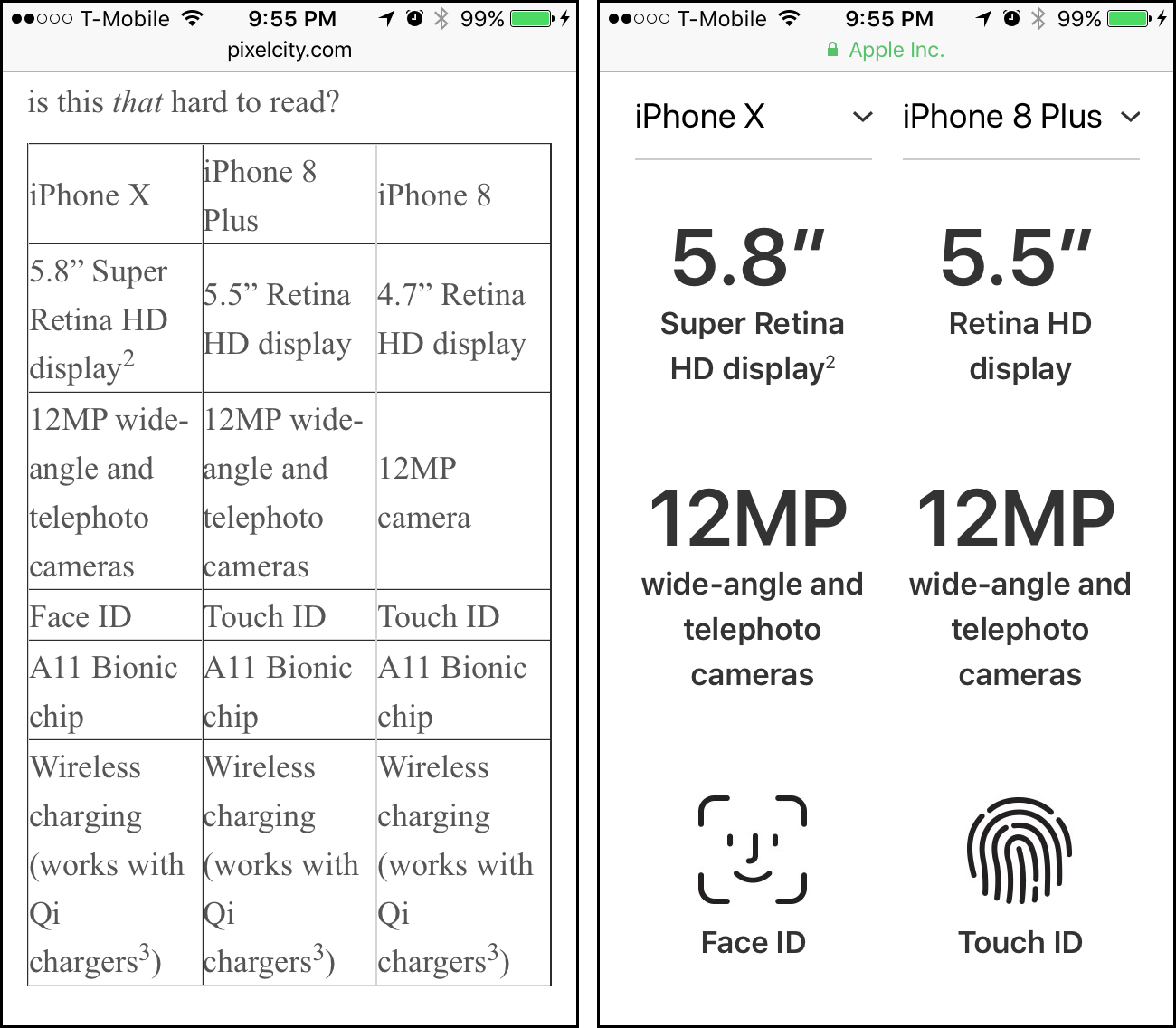
Here is the same info, coming in at 250 pixels tall on my desktop’s screen — just one quarter of the original height. Tell me, is this that hard to read?
| iPhone X | iPhone 8 Plus | iPhone 8 |
| 5.8” Super Retina HD display2 | 5.5” Retina HD display | 4.7” Retina HD display |
| 12MP wide-angle and telephoto cameras | 12MP wide-angle and telephoto cameras | 12MP camera |
| Face ID | Touch ID | Touch ID |
| A11 Bionic chip | A11 Bionic chip | A11 Bionic chip |
| Wireless charging (works with Qi chargers3) | Wireless charging (works with Qi chargers3) | Wireless charging (works with Qi chargers3) |
Also: that table shows up in its entirety on the 4" screen of my iPhone 5S. The Apple page? Just three rows of icons — and just two columns.
* Mac OS X 10.8, so yes, it’s Mac OS, not macOS.
Design Basics
There are a million articles online about design. Here are a couple of my favorites to get you started.
Great Design: What is Design? by Joel Spolsky
This contains my absolute favorite summary of what design really is:
Design, for my purposes, is about making tradeoffs. Let’s design a trashcan for a city street corner, shall we? Let me give you some design constraints. It has to be pretty light, because the dustboys, er, sanitation engineers come by and they have to pick it up to dump the trash in the garbage truck. Oh, and it has to be heavy, or it will blow away in the wind or get knocked over... It has to be really big. People throw away a lot of trash throughout the day and at a busy intersection if you don’t make it big enough, it overflows and garbage goes everywhere... Oh, also, it needs to be pretty small, because otherwise it’s going to take up room on the sidewalk... Ok, light, heavy, big, and small. What else. It should be closed on the top, so rubbish doesn’t fly away in the wind. It should be open on the top, so it’s easy to throw things away... Notice a trend? When you’re designing something, you often have a lot of conflicting constraints. In fact, that’s a key part of design: resolving all of these conflicting goals.
Affordances and Metaphors by Joel Spolsky
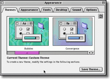
Starting in about 1992, these interfaces started to disappear, to be replaced with a new invention called tabbed dialogs:
Tabbed dialogs are a great affordance. It’s really obvious from this picture that you have six tabs; it’s really obvious which tab you’re on, and it’s really obvious how to switch to a different tab. When Microsoft first usability tested the tabbed dialog interface, usability went up from about 30% to 100%. Literally every single testee was able to figure out the tabbed dialogs.
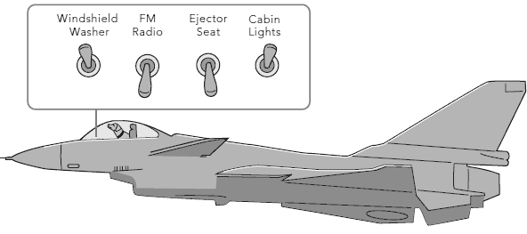
The Opposite of Fitts' Law by Jeff Atwood
The interface design must assure that a user can never inadvertently fire the ejector seat when all he wants to do is make some minor adjustment to the program.
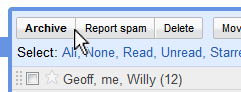
I can think of a half-dozen applications I regularly use where the ejector seat button is inexplicably placed right next to the cabin lights button. Let's take a look at our old friend GMail, for example:
Every few days I accidentally click Report Spam when I really meant to click Archive.
Vegas.com has a great logo.
That's all. I just love this. The stylized 'V' is also a downward-pointing arrow, indicating 'right here'. Perfect.