Pixel City
Oh look, another blog about design and technology.
Lightweight Web Pages
Here's a great article (transcript of a talk, actually) on making small web pages. (Small as in fast-loading and small file sizes.)
What do I mean by a website obesity crisis?
Here’s an article on GigaOm from 2012 titled "The Growing Epidemic of Page Bloat". It warns that the average web page is over a megabyte in size.
The article itself is 1.8 megabytes long.
Here's an almost identical article from the same website two years later, called “The Overweight Web". This article warns that average page size is approaching 2 megabytes.
That article is 3 megabytes long.
On a related note, there's this post at quirksmode:
Pushing the web forward currently means cramming in more copies of native functionality at breakneck speed — interesting stuff, mind you, but there’s just too much of it... I don’t think this is a particularly good place to push the web forward to. Native apps will always be much better at native than a browser. Instead, we should focus on the web’s strengths: simplicity, URLs and reach.
Logo and Icon Design
A general rule of logos is that they should work well at all sizes. It's worth pointing out, though, that you are allowed to manually tweak them if needed to make them work in certain situations. Craig Hockenberry discusses what he did to make his company's icon work at very small sizes.
The animation to the left shows the progression of changes Anthony made to align the roof and windows of our factory on a 256×256 grid. While we ended up with a shape that’s different than our official logo, it renders a lot more clearly in the space provided.
TiVo
The design of the new TiVo Bolt seems pretty silly. I can't see any good reason for it to be shaped the way it is.
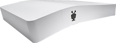
A/V components (and most things, really) should be flat, so they stack nicely. But TiVo used to be great at design. Two little things they did in the past stand out to me:
- I had a TiVo and I replaced its hard drive with a larger one. Later, I added a second drive. But the second time I had it open, I forgot to reconnect the fan. I woke up the next morning, and when I turned on my TV, I saw a message from my TiVo saying it had shut itself down due to heat. TiVo's engineers saved me from my own carelessness, and after reconnecting the fan, everything was fine, and that box worked for years. If they weren't so good, I would have woken up to an expensive, melted, non-functioning paperweight.
- I had another TiVo that I kept for many years. In 2007, Daylight Saving Time was changed in the U.S. My TiVo did not update itself to show the correct time but it never had problems recording things. They'd display at the wrong time, but everything still worked. A show that should be on at 8pm would show up in the menu at 7pm, I'd set it to record, and it'd record. I don't know how they kept the backend working, despite the frontend not, but I never missed a show.
How to design a deceptive headline
The headline: "Is Apple Music a Total Failure?"
The end of the article: "So, is Apple Music a total failure or just a slight disappointment? For the time being, I'd lean toward the latter."
Can you say "linkbait"? I knew you could. Seriously, Slate, you suck.
The Golden Ratio
Fun read. And I agree 100%.
"The golden ratio is total nonsense in design. Here's why."
Let me be clear. I agree with the general premise — that the ratio doesn't have any amazing properties. (Other than certain technical usefulness.) But lines like this — "'Strictly speaking, it's impossible for anything in the real-world to fall into the golden ratio, because it's an irrational number,' says Keith Devlin, a professor of mathematics at Stanford University." — are just flat out wrong. That's like saying that there's no such thing as a circle because pi is irrational. Oh wait, they go on to say that two sentences later: "Just as it's impossible to find a perfect circle in the real world, the golden ratio cannot strictly be applied to any real world object. It's always going to be a little off." Um, OK. Circles don't exist in the real world. Got it. Thank you, Fast Company!
Music Design
Meet the 44-year-old Swede who's been writing American pop hits for 20 years.
They also created a template for the Max Martin sound, which combines ABBA’s pop chords and textures, Denniz PoP’s song structure and dynamics, eighties arena rock’s big choruses, and early-nineties American R. & B. grooves. On top of all that is Sandberg’s gift for melody... Like many of ABBA’s tunes, these Backstreet Boys songs use major and minor chords in surprising combinations (going to a minor chord on the chorus, say, when you least expect it), producing happy songs that sound sad, and sad songs that make you happy—tunes that serve a wide variety of moods.
“... Baby One More Time” ... was ABBA with a groove, basically... Without being fully aware of it, he’d forged a brilliant sound all his own, and within a few weeks every American producer was desperately scrambling to emulate it.”
Swedish writers are not partial to wit, metaphor, or double entendre, songwriting staples from Tin Pan Alley through the Brill Building era. They are more inclined to fit the syllables to the sounds—a working method that Martin calls “melodic math”—and not worry too much about whether the resulting lines make sense. (The verses in “I Want It That Way,” for example, completely contradict the meaning of the chorus lines.) ... This very freedom from having to make sense lyrically has allowed the Swedes to soar to such melodic heights.
(Ugh. I just hate The New Yorker's archaic house style. "R. & B."? Really?)
iOS 9's 'News' app is not that great
Oh. My. God. This thing sucks out loud.
When setting it up, you have to choose a source from their short list to start. (CNN, The New York Times, Fox News, etc.) No way past it. Fine. I pick the NYT, figuring I'll delete it later. I add Daring Fireball. And Wired. I look at a couple things. I see no way to just look at just one source (i.e., just Wired.) I see no way to delete things from my list of sources. The tabs at the bottom (on my iPhone) are "For You", which has God knows what — I guess it's the NYT, mostly; "Favorites", which is empty; "Explore", which is like "browse", compared to the next tab, which is "Search", and then finally "Saved", which is empty because I haven't saved anything. And that's all there is.
Like I said, I see no way to look at a single content source and I see no way to delete any of the sources I've chosen. I google "how to use apple news" and the first match is a Wired article, "Apple News Is the Best New Thing About the iPad", with which I respectfully disagree. No useful links. I go to support.apple.com, click "iPhone", then "iOS 9", then "built-in apps", then "Learn more about News", and there's info about it but nothing on how to use it.
Oh yeah, and the way it lays out stories is worthless too. One-size-fits-all never works. (I don't like Flipboard, either.) You get a little box about 3/4" high with as much of the headline and/or some article content that fits, plus maybe an image.
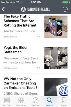
So basically, it's a minimally-configurable app, and you have nearly no control over what you see. It's like watching TV while a stranger works the remote. Toss. (Well, actually, you can't delete it, so it goes into the "Junk" folder, along with Stocks, Tips, and the rest.)
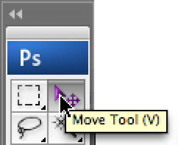
The Photoshop Alphabet
A - Path Selection Tool/Direct Selection Tool. (aka the Arrow tool)
B - Brush
C - Crop
D - Default Foreground and Background Colors (black foreground/white background)
E - Eraser
F - Full screen mode
G - Gradient/Paint Bucket
H - Hand (or, press and hold "space")
I - Eyedropper Tool (I = "eye")
J - Healing Brush Tool (and others) (no mnemonic)
K - Knife tool (don't let the silent K fool you!)
L - Lasso Tools
M - Marquee Tools
N - Notes Tool
O - Dodge Tool (and Burn and Sponge)
P - Pen Tool
Q - Quick Mask mode
R - Blur Tool (and Sharpen and Smudge)
S - Clone Stamp Tool (and Pattern Stamp Tool)
T - Type Tool
U - Line Tool (and other shapes) (no mnemonic)
V - Move Tool
W - Magic Wand
X - Exchange foreground and background colors
Y - History Brush Tools (no mnemonic)
Z - Zoom Tool (or, press and hold command/control-space to zoom in and option/alt-command/control-space to zoom out)