Pixel City
Oh look, another blog about design and technology.
Happy 25th birthday, Photoshop!
Enjoy this video of some current Photoshop users trying to use Photoshop 1.0.
Progress!
Stephen Hackett at 512 Pixels has a great writeup on how the iPad has changed in 5 years — and how much it hasn't. The most striking thing to me is that it's gone from 1/2 inch thick to 1/4 inch. As he points out, "the entire iPad Air 2 is as thick as the sidewall on the original iPad." (Referring to the gently tapered profile of the original iPad.)

Sound design?
Yup, love that too. It's everywhere — computers, cars, and even food.
Detail about fajitas is here:
Chili’s kept the recipe simple and relied primarily on the sizzle to not only turn heads but also trigger a barrage of senses: you hear them, then you notice the smoke and smell the aroma. Add up all of that, and you don’t just taste or see a neat-looking dish with Chili’s sizzling fajitas. You experience it.
Great job, Samsung!
No, really. Not being sarcastic here. They really did a great job with this series of fine-art-based ads.
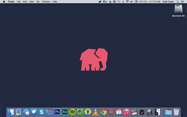
Arrange by Color
From an interview with Faith Korpi:
I arrange all the app icons in my dock by color because that’s the only way I’ll remember where everything is. I’ve tried sorting them by type and how often I use them, but by color is the only method that doesn’t leave me scanning the whole bar for the icon I’m looking for.
Good to know that...
... the targeting system for Terminators is coming along nicely: Dynamic Target Tracking Camera
Vague UI: Bad.
From Stephen Hackett's review of Evernote's new "Context" feature:
On the Mac app, the verbiage makes me think that Context can’t be turned off, just hidden. Clicking the “Manage Context Sources” button loads the Evernote web app, where sources can be turned off. These settings do sync with the iOS device, which is nice, but again, it’s unclear if this feature can be disabled completely.
This is very bad. There is a world of difference between "do/don't do" and "show/don't show". "Show/don't show" implies that the action is happening no matter what you choose. Unless you have good reason to do otherwise, it's generally better to build an app with settings that "do/don't do" instead of "show/don't show". It impacts many important things, including performance, battery life, network data usage, storage space usage, and privacy.
A Note to Designers
If you're going to put links at the bottom of your page, DO NOT use infinite scroll. Otherwise, cool site.
40 hidden logo symbols
Hiding symbols inside logos can be a gimmick, but it can also be done very well and for good reason. Here are a bunch that span the spectrum. Some are a bit of a reach (the hidden tire in the Continental logo?) but there are a lot of good ones here.
Pixar's Cars
Cars is one of the least-liked Pixar movies on most lists. Most people agree that even the worst Pixar movie is better than the average film, but beyond that, I think it is very underrated. I think it's one of the best, especially for young kids, for many reasons.
The story is very simple: a racecar wants to win a race, but he gets lost on the way, and winds up making new friends. That's it. It's not a complicated plot. There's no violence, other than cars pushing each other around a bit. Nothing scary. No dead parents. No monsters. No warping of time and space. No evil villains. No giant sharks. No sadistic kids. No toys getting pulled apart or being tossed into a grinder or incinerator. You don't need to know anything about how the world works — fossil fuels, energy production, land rights, or economics. No complicated references to other film genres or mythology.
Granted, Cars 2 is pretty much the exact opposite, but the original Cars has many great qualities that a lot of people overlook.
UPDATE: Antony Johnston was kind enough to let me talk about Cars on his podcast, Unjustly Maligned. The episode is here.