Pixel City
Oh look, another blog about design and technology.
Design Basics
There are a million articles online about design. Here are a couple of my favorites to get you started.
Great Design: What is Design? by Joel Spolsky
This contains my absolute favorite summary of what design really is:
Design, for my purposes, is about making tradeoffs. Let’s design a trashcan for a city street corner, shall we? Let me give you some design constraints. It has to be pretty light, because the dustboys, er, sanitation engineers come by and they have to pick it up to dump the trash in the garbage truck. Oh, and it has to be heavy, or it will blow away in the wind or get knocked over... It has to be really big. People throw away a lot of trash throughout the day and at a busy intersection if you don’t make it big enough, it overflows and garbage goes everywhere... Oh, also, it needs to be pretty small, because otherwise it’s going to take up room on the sidewalk... Ok, light, heavy, big, and small. What else. It should be closed on the top, so rubbish doesn’t fly away in the wind. It should be open on the top, so it’s easy to throw things away... Notice a trend? When you’re designing something, you often have a lot of conflicting constraints. In fact, that’s a key part of design: resolving all of these conflicting goals.
Affordances and Metaphors by Joel Spolsky
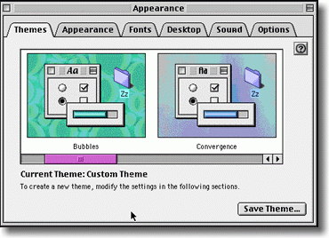
Starting in about 1992, these interfaces started to disappear, to be replaced with a new invention called tabbed dialogs:
Tabbed dialogs are a great affordance. It’s really obvious from this picture that you have six tabs; it’s really obvious which tab you’re on, and it’s really obvious how to switch to a different tab. When Microsoft first usability tested the tabbed dialog interface, usability went up from about 30% to 100%. Literally every single testee was able to figure out the tabbed dialogs.
The Opposite of Fitts' Law by Jeff Atwood
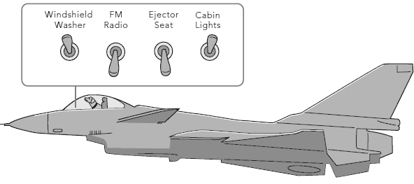
The interface design must assure that a user can never inadvertently fire the ejector seat when all he wants to do is make some minor adjustment to the program.
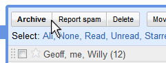
I can think of a half-dozen applications I regularly use where the ejector seat button is inexplicably placed right next to the cabin lights button. Let's take a look at our old friend GMail, for example:
Every few days I accidentally click Report Spam when I really meant to click Archive.
Vegas.com has a great logo.
That's all. I just love this. The stylized 'V' is also a downward-pointing arrow, indicating 'right here'. Perfect.

Happy 20th birthday!
$ whois pixelcity.com
Domain Name: PIXELCITY.COM
Registrar: ENOM, INC.
Sponsoring Registrar IANA ID: 48
Whois Server: whois.enom.com
Referral URL: http://www.enom.com
Name Server: H1.CORE-DNS.NET
Name Server: H2.CORE-DNS.NET
Creation Date: 27-jul-1997
Log in, log out, login, logout.
"Log in" and "log out" are verbs. "Use this form to log in. Click this icon to log out."
"Login" and "logout" are adjectives. "Visit the login screen. The logout process is complete."
They can also be nouns. "Login was successful. So was logout."
I'm just posting this because I'm tired of seeing things like "Click here to login" everywhere.
"Sign up" is the same way — you can sign up for a meeting on the signup page.
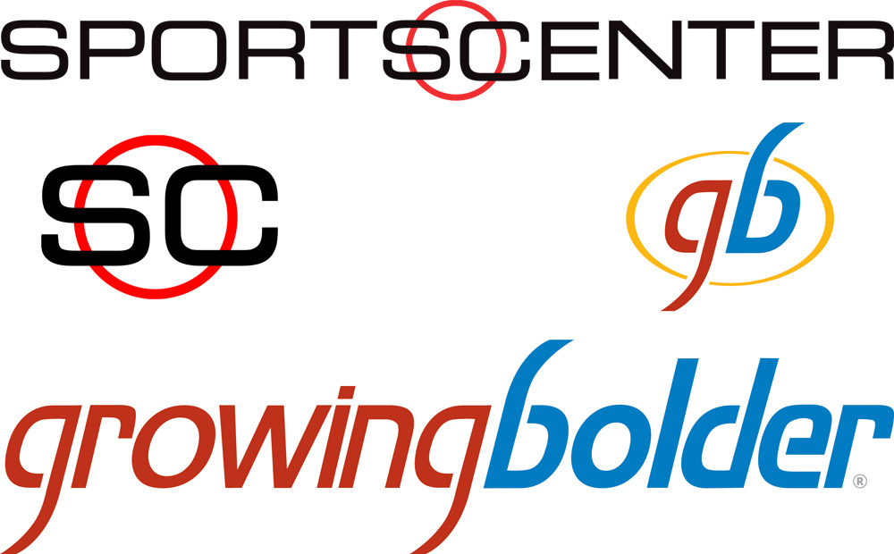
Random thing: logos
This is just a random thing that popped into my head while eating at a place where SportsCenter was on. If you are making a logo with two words, and the first word starts and ends with the same letter, you can use this trick:
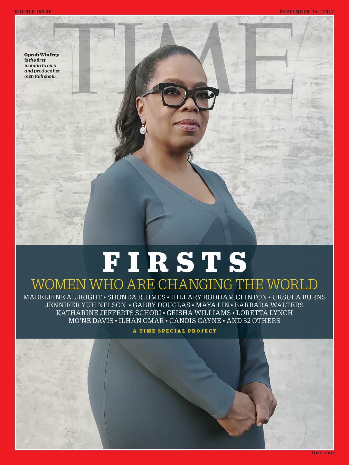
Magazine covers shot with iPhones
A few of these stories came out at about the same time so I figured it was worth saving them in one place. Three major magazines have recently used photos that were shot with iPhones on their covers: Traveler from Conde Nast, Billboard, and Bon Appétit.

UPDATE, September 7, 2017: Also shooting covers with an iPhone is a little magazine called Time.
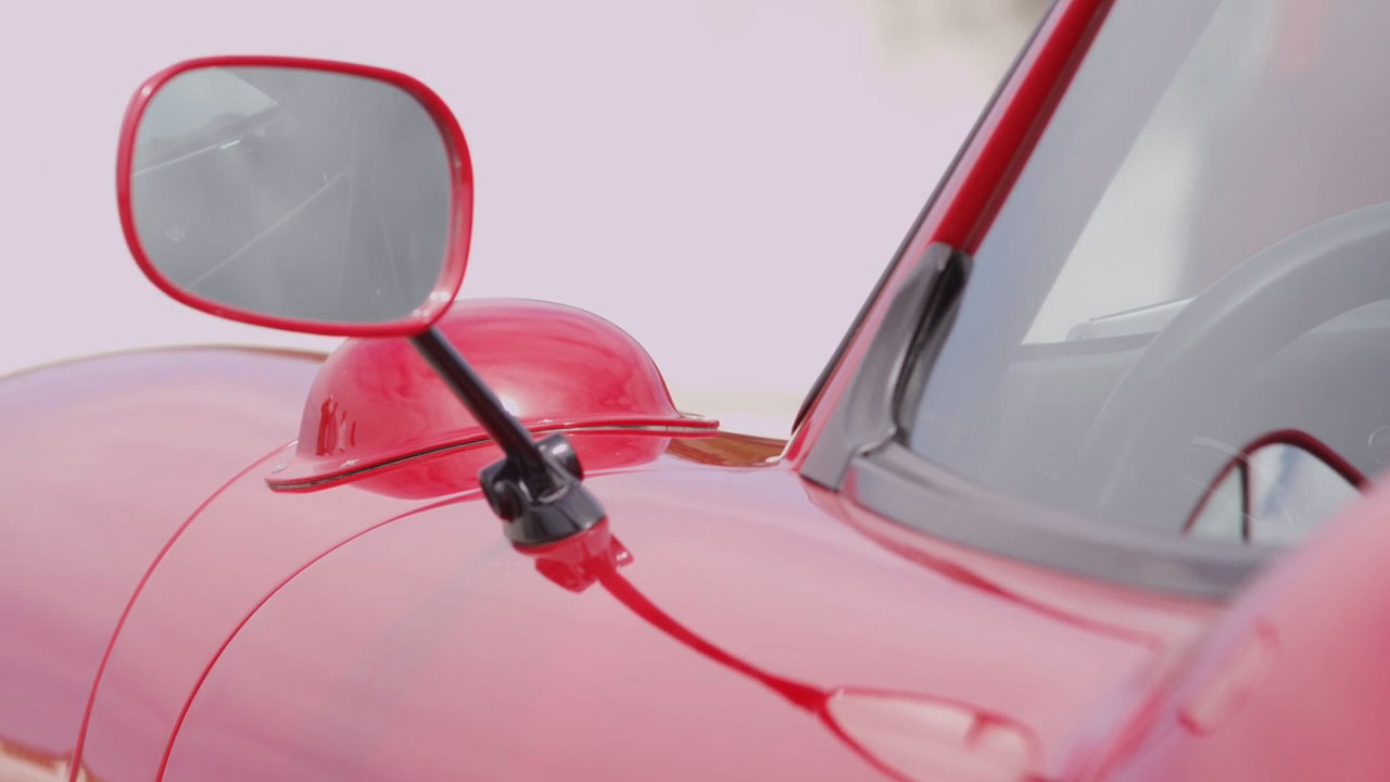
Car Design
Well-known designer Peter Brock recounts designing the Daytona Coupe in the 1960s. (13 minutes)
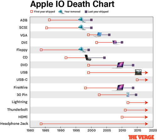
Apple Ports: they come, they go.
This is a great piece and it's totally the kind of thing I would do. Now I feel bad that I didn't have the idea first. Great job, The Verge.
Shifter Design
Whether it caused a death or not, this design is pretty bad. If the position is important, make the position apparent.
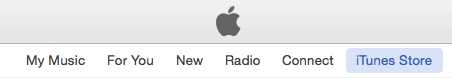
Whose point of view?
iTunes: It should either be "My music" and "For me", or "Your music" and "For you". :-|